
matplotlibで凡例(legend)を設定する方法を解説します。凡例はグラフの要素を識別するために重要な役割を果たします。本記事では、凡例の位置、ラベル、外観、サイズなど、様々な設定方法を具体的なコード例とともに紹介します。
基本的な使い方
凡例を表示するには、プロット後にlegend()メソッドを呼び出します。
import matplotlib.pyplot as plt
import numpy as np

# データの準備
x = np.linspace(0, 10, 100)
y1 = np.sin(x)
y2 = np.cos(x)

# プロット
plt.figure(figsize=(8, 5))
plt.plot(x, y1, label='Sin')
plt.plot(x, y2, label='Cos')

# 凡例の表示
plt.legend()

plt.title('Basic Legend Example')
plt.xlabel('X axis')
plt.ylabel('Y axis')
plt.grid(True)
plt.show()
# 出力: 基本的な凡例が右上に表示されたグラフ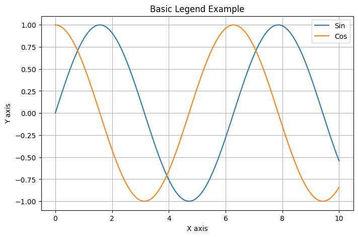
このコードでは、labelパラメータでプロットの名前を指定し、legend()メソッドで凡例を表示しています。デフォルトでは、凡例は右上に配置されます。
位置
凡例の位置はlocパラメータで指定できます。文字列または数値で位置を指定できます。以下に主な位置の指定方法を一覧で示します。
| 文字列指定 | 数値指定 | 位置 |
|---|---|---|
'best' | 0 | 最適な位置(デフォルト) |
'upper right' | 1 | 右上 |
'upper left' | 2 | 左上 |
'lower left' | 3 | 左下 |
'lower right' | 4 | 右下 |
'right' | 5 | 右中央 |
'center left' | 6 | 左中央 |
'center right' | 7 | 右中央 |
'lower center' | 8 | 下中央 |
'upper center' | 9 | 上中央 |
'center' | 10 | 中央 |
以下のコードで文字列による位置指定の例を示します。
import matplotlib.pyplot as plt
import numpy as np

# データの準備
x = np.linspace(0, 10, 100)
y1 = np.sin(x)
y2 = np.cos(x)

# プロット
plt.figure(figsize=(8, 5))
plt.plot(x, y1, label='Sin')
plt.plot(x, y2, label='Cos')

# 凡例の位置を文字列で指定
plt.legend(loc='lower right')  # 右下に配置

plt.title('Legend Position Example (String)')
plt.xlabel('X axis')
plt.ylabel('Y axis')
plt.grid(True)
plt.show()
# 出力: 凡例が右下に表示されたグラフ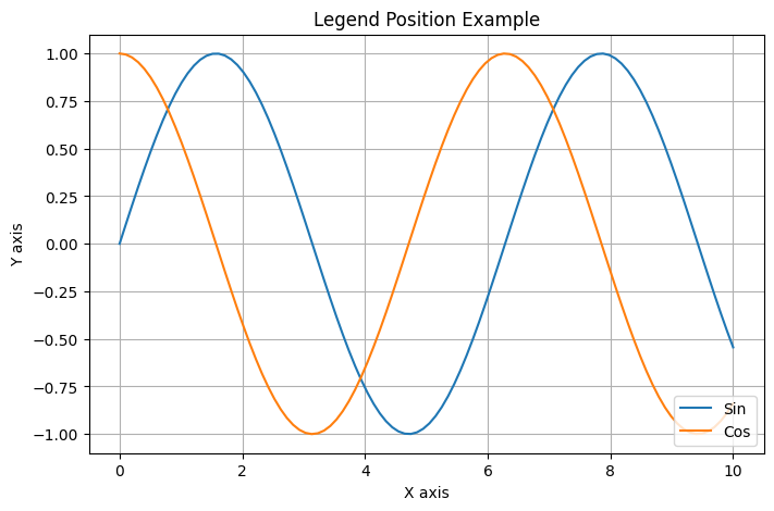
数値を使用して位置を指定することもできます。以下は数値による位置指定の例です。
import matplotlib.pyplot as plt
import numpy as np

# データの準備
x = np.linspace(0, 10, 100)
y1 = np.sin(x)
y2 = np.cos(x)

# プロット
plt.figure(figsize=(8, 5))
plt.plot(x, y1, label='Sin')
plt.plot(x, y2, label='Cos')

# 凡例の位置を数値で指定
plt.legend(loc=4)  # 4は右下を意味する

plt.title('Legend Position Example (Numeric)')
plt.xlabel('X axis')
plt.ylabel('Y axis')
plt.grid(True)
plt.show()
# 出力: 凡例が右下に表示されたグラフ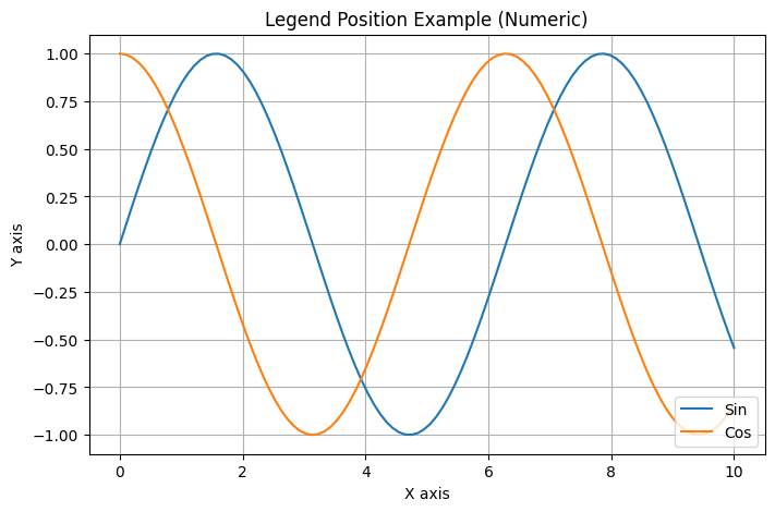
また、bbox_to_anchorパラメータを使用して、より細かく位置を調整できます。
import matplotlib.pyplot as plt
import numpy as np

# データの準備
x = np.linspace(0, 10, 100)
y1 = np.sin(x)
y2 = np.cos(x)

# プロット
plt.figure(figsize=(8, 5))
plt.plot(x, y1, label='Sin')
plt.plot(x, y2, label='Cos')

# 凡例の位置を細かく指定
plt.legend(bbox_to_anchor=(1.05, 1), loc='upper left')

plt.title('Custom Legend Position')
plt.xlabel('X axis')
plt.ylabel('Y axis')
plt.grid(True)
plt.tight_layout()
plt.show()
# 出力: 凡例がグラフの右側に表示されたグラフ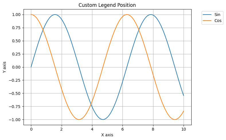
このコードでは、bbox_to_anchor=(1.05, 1)で凡例をグラフの右側に配置しています。
ラベル
凡例のラベルはプロット時にlabelパラメータで指定できますが、後から変更することも可能です。
import matplotlib.pyplot as plt
import numpy as np

# データの準備
x = np.linspace(0, 10, 100)
y1 = np.sin(x)
y2 = np.cos(x)

# プロット(ラベルなし)
plt.figure(figsize=(8, 5))
line1, = plt.plot(x, y1)
line2, = plt.plot(x, y2)

# 後からラベルを設定
plt.legend([line1, line2], ['Sin Function', 'Cos Function'])

plt.title('Custom Legend Labels')
plt.xlabel('X axis')
plt.ylabel('Y axis')
plt.grid(True)
plt.show()
# 出力: カスタムラベルを持つ凡例が表示されたグラフ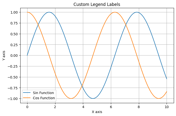
このコードでは、プロット後にlegend()メソッドでラベルを指定しています。
外観
凡例の外観(枠線、背景色、透明度など)をカスタマイズできます。以下に主な外観の指定方法を一覧で示します。
| パラメータ | 説明 | 値の例 |
|---|---|---|
frameon | 枠線の表示/非表示 | True/False |
facecolor | 背景色 | 'lightgray', 'white', '#e0e0e0' |
edgecolor | 枠線の色 | 'black', 'blue', '#000000' |
framealpha | 背景の透明度 | 0.0〜1.0(0: 完全透明、1: 不透明) |
shadow | 影の表示/非表示 | True/False |
borderpad | 凡例の内側の余白 | 0.5, 1.0 |
borderaxespad | 凡例とグラフの間の余白 | 0.5, 1.0 |
以下のコードで外観をカスタマイズする例を示します。
import matplotlib.pyplot as plt
import numpy as np

# データの準備
x = np.linspace(0, 10, 100)
y1 = np.sin(x)
y2 = np.cos(x)

# プロット
plt.figure(figsize=(8, 5))
plt.plot(x, y1, label='Sin')
plt.plot(x, y2, label='Cos')

# 凡例の外観をカスタマイズ
plt.legend(
    frameon=True,           # 枠線を表示
    facecolor='lightgray',  # 背景色
    edgecolor='black',      # 枠線の色
    framealpha=0.7,         # 透明度
    shadow=True             # 影をつける
)

plt.title('Legend Appearance Customization')
plt.xlabel('X axis')
plt.ylabel('Y axis')
plt.grid(True)
plt.show()
# 出力: 外観がカスタマイズされた凡例を持つグラフ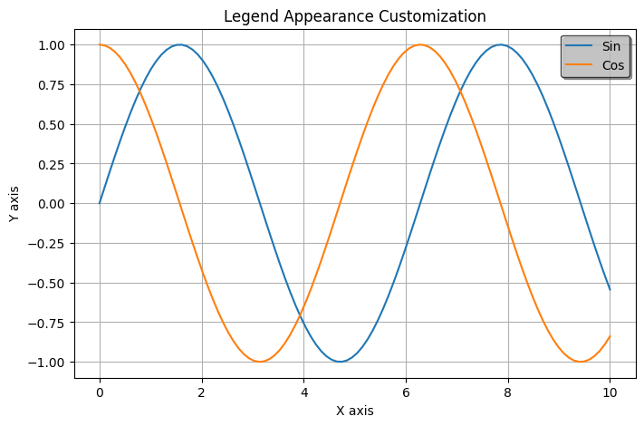
このコードでは、凡例に灰色の背景と黒い枠線を設定し、透明度を70%に設定しています。また、影も追加しています。
サイズとフォント
凡例のフォントサイズやスタイルを変更できます。以下に主なサイズとフォントの指定方法を一覧で示します。
| パラメータ | 説明 | 値の例 |
|---|---|---|
fontsize | 凡例テキストのフォントサイズ | 10, 12, 'small', 'large' |
title | 凡例のタイトル | 'Functions', 'Data Series' |
title_fontsize | タイトルのフォントサイズ | 12, 14, 'medium' |
prop | フォントプロパティ(辞書形式) | {'family': 'monospace'}, {'weight': 'bold'} |
labelcolor | ラベルの色 | 'black', 'blue', '#FF0000' |
markerscale | マーカーのスケール | 1.0, 1.5 |
以下のコードでフォントとサイズをカスタマイズする例を示します。
import matplotlib.pyplot as plt
import numpy as np

# データの準備
x = np.linspace(0, 10, 100)
y1 = np.sin(x)
y2 = np.cos(x)

# プロット
plt.figure(figsize=(8, 5))
plt.plot(x, y1, label='Sin')
plt.plot(x, y2, label='Cos')

# フォントサイズとスタイルを設定
plt.legend(
    fontsize=12,                  # フォントサイズ
    title='Functions',            # 凡例のタイトル
    title_fontsize=14,            # タイトルのフォントサイズ
    prop={'family': 'monospace'}  # フォントファミリー
)

plt.title('Legend Font Customization')
plt.xlabel('X axis')
plt.ylabel('Y axis')
plt.grid(True)
plt.show()
# 出力: フォントがカスタマイズされた凡例を持つグラフ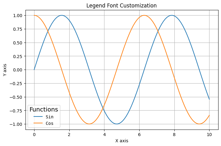
このコードでは、凡例のフォントサイズを12ptに設定し、タイトルを追加してそのフォントサイズを14ptに設定しています。また、等幅フォントを使用しています。
配置とレイアウト
凡例内の要素の配置方法を変更できます。以下に主な配置とレイアウトの指定方法を一覧で示します。
| パラメータ | 説明 | 値の例 |
|---|---|---|
ncol | 凡例の列数 | 1, 2, 3 |
columnspacing | 列間のスペース | 0.8, 1.0, 1.5 |
labelspacing | ラベル間の垂直スペース | 0.5, 0.8, 1.0 |
handlelength | ハンドル(線やマーカー)の長さ | 1.0, 1.5, 2.0 |
handletextpad | ハンドルとテキスト間のスペース | 0.5, 0.8 |
handleheight | ハンドルの高さ | 0.7, 1.0 |
mode | 凡例の配置モード | 'expand'(幅いっぱいに広げる) |
以下のコードで配置とレイアウトをカスタマイズする例を示します。
import matplotlib.pyplot as plt
import numpy as np

# データの準備
x = np.linspace(0, 10, 100)
y1 = np.sin(x)
y2 = np.cos(x)
y3 = np.sin(x) * np.cos(x)
y4 = np.sin(x) ** 2

# プロット
plt.figure(figsize=(8, 5))
plt.plot(x, y1, label='Sin')
plt.plot(x, y2, label='Cos')
plt.plot(x, y3, label='Sin * Cos')
plt.plot(x, y4, label='Sin^2')

# 凡例の配置を変更
plt.legend(
    ncol=2,           # 2列で表示
    columnspacing=1,  # 列間のスペース
    labelspacing=0.5, # ラベル間のスペース
    handlelength=1.5  # ハンドルの長さ
)

plt.title('Legend Layout Customization')
plt.xlabel('X axis')
plt.ylabel('Y axis')
plt.grid(True)
plt.show()
# 出力: 2列で表示された凡例を持つグラフ
このコードでは、凡例を2列で表示し、列間のスペースやラベル間のスペースを調整しています。
マーカーとハンドル
凡例のマーカーやハンドルをカスタマイズできます。
import matplotlib.pyplot as plt
import numpy as np

# データの準備
x = np.linspace(0, 10, 100)
y1 = np.sin(x)
y2 = np.cos(x)

# プロット
plt.figure(figsize=(8, 5))
plt.plot(x, y1, label='Sin')
plt.plot(x, y2, label='Cos')

# 凡例のハンドルをカスタマイズ
legend = plt.legend()

# 凡例の各ハンドルを取得してカスタマイズ
handles = legend.get_lines()  # legendHandlesではなくget_lines()を使用
handles[0].set_linewidth(4.0)  # 1つ目の線の太さを変更
handles[1].set_linestyle(':')  # 2つ目の線のスタイルを点線に変更

plt.title('Legend Handle Customization')
plt.xlabel('X axis')
plt.ylabel('Y axis')
plt.grid(True)
plt.show()
# 出力: ハンドルがカスタマイズされた凡例を持つグラフ
このコードでは、凡例のハンドルを取得し、1つ目の線の太さを変更し、2つ目の線のスタイルを点線に変更しています。
また、カスタムハンドルを作成することもできます。
import matplotlib.pyplot as plt
import numpy as np
from matplotlib.lines import Line2D

# データの準備
x = np.linspace(0, 10, 100)
y1 = np.sin(x)
y2 = np.cos(x)

# プロット(ラベルなし)
plt.figure(figsize=(8, 5))
plt.plot(x, y1)
plt.plot(x, y2)

# カスタムハンドルを作成
custom_lines = [
    Line2D([0], [0], color='blue', lw=2),
    Line2D([0], [0], color='orange', lw=2, marker='o', markersize=8)
]

# カスタムハンドルで凡例を作成
plt.legend(custom_lines, ['Sin Wave', 'Cos Wave'])

plt.title('Custom Legend Handles')
plt.xlabel('X axis')
plt.ylabel('Y axis')
plt.grid(True)
plt.show()
# 出力: カスタムハンドルを持つ凡例が表示されたグラフ
このコードでは、Line2Dオブジェクトを使用してカスタムハンドルを作成し、それを使って凡例を表示しています。
まとめ
matplotlibの凡例(legend)は様々な方法でカスタマイズできます。主な設定項目は以下の通りです:
- 基本的な表示:
plt.legend() - 位置の指定:
plt.legend(loc='lower right') - ラベルのカスタマイズ:
plt.legend([line1, line2], ['Label1', 'Label2']) - 外観の設定: 背景色、枠線、透明度など
- フォントとサイズの調整:
fontsize、title_fontsizeなど - 配置とレイアウト:
ncol、columnspacingなど - ハンドルのカスタマイズ: 線の太さ、スタイルなど
これらの設定を組み合わせることで、グラフの見栄えを大幅に向上させることができます。凡例は情報を伝える重要な要素なので、適切に設定することでグラフの可読性と理解しやすさが向上します。
さらに詳細な設定をしたい場合は、公式を参照ください。